Every vertical pixel used for the UI bar signifies a theft from those who hunger and are not fed, those who are cold and are not clothed.
— Fakey Fakerson1
Here’s a screenshot of Red Hat’s OpenShift Console viewed with Firefox on stock GNOME Shell:
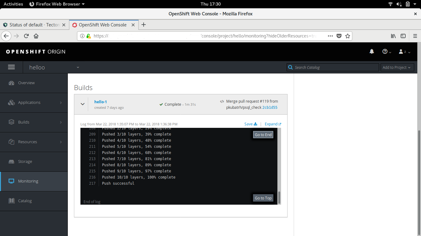
You might notice a problem with this user interface: The top third of the screen is permanently occupied with stuff I don’t care about.2
This screenshot is particularly egregious, but it exemplifies a common issue. Every layer in the UI stack eats vertical pixels. The OS has a menu bar. The application window has a title bar. The browser has tab and location bars. Finally, the website has two fixed bars: one containing a logo and user info; another for project info. Combine all of these with modern 16:9 screens, and you have a recipe for frustration.
I’m sure if you asked each UI designer involved, they’d feel justified in their decision. The OS needs a menu bar. Application windows need title bars. Browsers need location and tab bars. No single pebble is responsible for the avalanche.
But if you are a web designer, and you think that having a fixed bar on your site makes for happier users, you are almost certainly mistaken. If you must add a top bar, hide it as the user scrolls down, then show it on scroll up. This interaction pattern is common on mobile devices and it’s not much effort to add to PCs. You can use a library like Headroom.js.
Hopefully, future designers will look back on this era of vertical annexation the same way we view excesses such as the <blink> tag.
-
Hat tip to Gwern for bringing this tweet to my attention. ↩
-
Vertical space isn’t the only issue with that UI. The fonts are small and low contrast. The scrollbar takes up the entire height of the browser window, but the top two bars are fixed. Also, there’s a ton of wasted space on the right where that log viewer could expand to. ↩